Check PDF Spot Colors: Confirm Named Inks, Plates, and Brand Separations Before Proofing or Press
To check PDF spot colors, open the exact production PDF in a properties, separations, or preflight-style view and confirm which named inks are actually present, where they are used, and whether they should remain spot instead of process color.
If the file shows missing, renamed, duplicate, or unexpected spot colors, fix it before proofing, packaging approval, or press handoff.
That is the short answer. The more useful answer is that spot-color problems rarely look dramatic in a casual screen preview. A PDF can appear perfectly normal while quietly carrying an extra plate, the wrong ink name, a duplicate CMYK build, or a brand color that was converted on the way out. That is why a quick spot-color check matters most near the end of the workflow, when you still have time to correct the real deliverable instead of explaining the surprise later.
Fastest practical path: confirm the named spot inks, inspect where each one is used, then cross-check overprint and output intent before you approve the final PDF.
In a hurry? Jump to the 5-minute spot-color review.
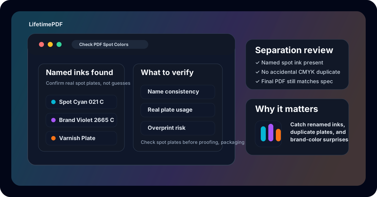
Table of contents
- Quick start: check PDF spot colors in about 5 minutes
- What spot colors actually mean in a PDF
- Spot colors vs CMYK, overprint, layers, and output intent
- Step-by-step: practical spot-color review workflow
- What to look for in names, plates, and brand-color usage
- Common spot-color mistakes and what they usually mean
- When to rename, rebuild, or re-export the file
- Related LifetimePDF tools and guides
- FAQ (People Also Ask)
Quick start: check PDF spot colors in about 5 minutes
If your real goal is simple — make sure this PDF carries the right named inks and no separation surprises — use this order:
- Open the exact PDF that will actually be proofed, uploaded, approved, printed, or sent to a vendor.
- Read the file's named color list in a properties or preflight-style view and confirm which spot inks are present.
- Check whether those spot colors match the real print specification, packaging brief, or brand instructions.
- Inspect where each spot plate is used so logos, labels, varnish marks, or technical elements are on the right separation.
- Cross-check nearby print signals such as overprint, output intent, and ICC profile.
- If the spot-color setup looks wrong, correct the artwork or re-export the PDF, then reopen the finished file once to verify the final copy.
What spot colors actually mean in a PDF
In practical terms, a spot color is a named ink or named separation that travels through the PDF as its own color instruction instead of being reduced to standard process color alone. That matters in packaging, labels, brand-critical print jobs, specialty finishes, dielines, varnish workflows, and any situation where a separate plate is part of the production plan.
The point of checking spot colors is not just proving that some named swatch exists. It is confirming that the file tells the right print story. The correct spot color should be named consistently, used on the right objects, and preserved as a real spot plate in the outgoing PDF. If the named ink disappeared, split into duplicates, or turned into an ordinary process build, the file may still look acceptable on screen while behaving very differently in production.
| State | What it usually means | Why it matters |
|---|---|---|
| Named spot color present | The PDF still carries a dedicated ink or separation by name | Usually good when the print plan truly requires that plate |
| Duplicate spot names | The same intended ink may exist under slightly different labels | Can create extra plates, confusion, or cleanup questions at handoff |
| Spot color converted to process | The visual color may remain close, but the dedicated plate is gone | Can break packaging, varnish, foil, or brand-specific print plans |
| Unexpected spot plate | An extra named ink or technical plate entered the file | Can trigger cost, workflow, or proofing problems late in production |
Spot colors vs CMYK, overprint, layers, and output intent
Several print-prep ideas get mixed together because they often show up in the same jobs. Separating them makes troubleshooting much easier.
| Concept | What it tells you | What it does not tell you |
|---|---|---|
| Spot colors | Whether the PDF carries named inks or dedicated separations | How those objects interact when stacked over other objects |
| CMYK or process color | How standard process-color values are encoded | Whether a dedicated brand or specialty ink plate still exists |
| Overprint | Whether one object prints on top of another or knocks it out | Whether the underlying color is a named spot plate in the first place |
| Layers | How optional content may be grouped or toggled | Whether the color naming and plate setup are production-safe |
| Output intent | The declared destination or print condition the file targets | Whether a logo, varnish, or brand element still lives on the correct spot plate |
This is why a PDF can have the correct spot color names but still fail overprint review, or the right output intent but the wrong separation setup. Production trouble often comes from small mismatches stacking together instead of one dramatic error.
Step-by-step: practical spot-color review workflow
Here is the most useful way to check PDF spot colors on a real production file without turning a quick review into an all-day prepress exercise.
1) Open the exact outgoing PDF
Do not inspect a screenshot, a proof image, or an earlier export. Spot-color checks only matter on the file that will actually leave your hands.
2) Read the named color list first
Start with View PDF Properties or another metadata-aware or preflight-style inspection path and see whether the PDF contains named inks. If the file should contain a brand spot, varnish plate, foil plate, or packaging separation and you cannot find it, that absence is already useful information.
3) Compare the names against the real spec
A good spot-color check is not just “some spot plate exists.” It is whether the names are consistent with the production plan. Tiny naming differences can matter because they may create duplicate plates or force a press operator to guess which plate is supposed to survive.
4) Inspect where each spot plate is actually used
Confirm the spot color appears on the right objects: logos, packaging panels, technical marks, varnish masks, foil cues, or other designated elements. If the same visual color shows up both as a spot plate and as a separate process-color build, you may be looking at a duplicate workflow problem rather than a clean file.
5) Cross-check the wider print story
Pair the spot-color review with overprint, output intent, ICC profile, and layers. Spot colors make more sense when the rest of the production setup also points in the same direction.
6) Save, reopen, and verify the final copy once
If you rename inks, rebuild artwork, flatten a delivery copy, or re-export the PDF, reopen the finished file once more. Never assume the plate structure survived the fix until the actual outgoing PDF proves it.
Reliable sequence: inspect named inks, compare names with the print spec, verify real plate usage, cross-check overprint and output intent, then reopen the final saved PDF once before handoff.
What to look for in names, plates, and brand-color usage
Most spot-color reviews become easier once you know where the real risks hide.
Name consistency
Watch for tiny label changes, extra spaces, alternate suffixes, or renamed brand inks that can split one intended plate into several.
Real plate usage
Check that only the intended logos, finishes, or technical elements use the spot plate instead of stray shapes or duplicate artwork.
Process-color duplicates
Look for the same visual element built once as a spot color and again as CMYK, which can create muddy output or extra production questions.
This matters most in branded print, labels, packaging, retail signage, technical production files, and specialty finishing workflows. Those are the environments where a small naming mistake can become a real cost, a proof rejection, or a press delay. That is also why it helps to review trapped status and overprint behavior when the job depends on spot inks stacking correctly.
| Object type | Why it is risky | What to verify |
|---|---|---|
| Brand logos | One renamed or converted ink can break consistent brand output | Whether the intended named spot color is still present and used only where expected |
| Packaging or label marks | Technical plates may drive varnish, foil, white ink, or other specialty output | Whether the dedicated plate still exists as its own named separation |
| Artwork on colored backgrounds | Spot colors can interact badly with wrong knockout or overprint settings | Whether the plate setup and overprint behavior agree with the design intent |
| Shared templates or vendor exports | Old plate names and duplicate swatches often sneak in here | Whether the final PDF still reflects the current job spec rather than inherited baggage |
Common spot-color mistakes and what they usually mean
The same patterns show up repeatedly when a PDF has spot-color trouble.
The spot ink name changed slightly
This often means the same intended plate now exists under more than one label, which can create duplicate separations at output time.
The file looks right but the named spot plate is gone
The color may have been converted to process color during export, flattening, or a vendor handoff even though the visual preview stayed close enough to fool a quick review.
An extra plate appears unexpectedly
A stale template swatch, hidden object, specialty finish layer, or alternate export setting may have introduced a plate the current job does not need.
The same element seems to exist as both spot and CMYK
This usually points to duplicate artwork, mixed export logic, or a conversion path that left one process-color build behind.
The helpful habit is not memorizing obscure prepress trivia. It is noticing when the PDF's hidden separation logic stops matching the real production intent.
When to rename, rebuild, or re-export the file
Not every spot-color issue needs the same response.
Leave it alone when the plate structure matches the job
If the named spot colors are correct, the plate count is expected, and the usage matches the production plan, there is no prize for changing a stable file.
Rename or consolidate when the logic is right but the labels are messy
If one intended ink exists under multiple nearly identical names, a careful cleanup may be enough. The goal is one clear production story, not a pile of near-duplicate plate names.
Fix the artwork when the wrong objects sit on the plate
If stray shapes, duplicate logos, or accidental process-color builds are involved, the cleanest repair is usually in the source artwork rather than a last-minute patch after export.
Re-export when the whole file feels inconsistent
If spot-color problems show up alongside wrong overprint behavior, stale output intent, layer confusion, or broader print-prep mismatches, the safer solution is usually a fresh export path rather than a chain of tiny fixes.
| Situation | Best move | Why |
|---|---|---|
| The spot-color setup matches the print plan | Keep it | The PDF is already telling the right production story |
| One intended plate is split across multiple names | Consolidate the names carefully | That can remove confusion without rebuilding the whole job |
| The wrong objects are assigned to a spot plate | Fix the artwork | A targeted artwork correction is cleaner than hoping the plate issue disappears later |
| Multiple print signals conflict | Re-export the file | The PDF likely has a wider production setup problem, not just one naming issue |
A dependable default sequence is this: check the named spot inks → compare the labels with the job spec → verify where each plate is used → cross-check overprint and output intent → fix the artwork when needed → re-export when the wider print story feels inconsistent → reopen the final saved PDF once before handoff.
Related LifetimePDF tools and guides
View PDF Properties
Start here when you want the clearest overview of the file's stored color, document, and production properties before you trust the outgoing copy.
Open the guideCheck PDF Overprint
Use this when the real question is how the spot plate behaves when stacked over other objects in the final print workflow.
Read the overprint guideCheck PDF Output Intent
Helpful when you want the file's declared destination and the spot-color setup to tell the same production story.
Review output intentCheck PDF ICC Profile
Pair this with a spot-color review when the job is color-sensitive and you want the file's wider color-management setup to make sense too.
Read the ICC-profile guideCheck PDF Layers
Useful when alternate artwork, dielines, varnish masks, or technical elements may sit on optional layers around the same spot plates.
Open the layers guideCheck PDF Trapped
Review the trapped status when the file is headed to press and you want the wider print-prep metadata to stay aligned.
Read the trapped guideFAQ (People Also Ask)
How do I check PDF spot colors?
Open the exact production PDF in a properties, separations, or preflight-style view and confirm which named spot inks are present, where they are used, and whether they match the real print specification.
What is a spot color in a PDF?
A spot color is a named ink or named separation stored in the PDF so it can output as its own plate rather than existing only as standard process color.
Can a PDF contain both spot colors and CMYK?
Yes. Many production PDFs mix process color with one or more spot inks. The important part is confirming the spot plate is intentional, named correctly, and not accidentally duplicated by a process-color version of the same artwork.
Is checking spot colors the same as checking overprint?
No. Spot-color checks focus on named inks and dedicated plates, while overprint checks focus on how stacked objects print on top of one another or knock out underneath.
Why should I check spot colors before press handoff?
Because renamed inks, duplicate plates, accidental CMYK conversions, or the wrong objects on a spot plate can cause brand-color drift, extra print cost, or production delays that are much easier to fix before the file leaves your hands.
Ready to sanity-check a press-bound PDF before it creates a plate or brand-color surprise?
Best default workflow: confirm the named spot inks → inspect where they are used → cross-check overprint and output intent → correct the artwork or re-export when needed → verify the final PDF once before handoff
Published by LifetimePDF — Pay once. Use forever.