How to Check PDF Fonts on iPhone: Files, Preview, and Font Trouble Before You Share
To check PDF fonts on iPhone, save the final PDF into Files, open the exact copy you plan to share, and compare how headings, symbols, and body text render with what happens during text extraction or Word conversion.
If spacing shifts, bullets break, or special characters change, the PDF likely has font substitution, weak embedding, or OCR-related trouble that should be fixed before the file leaves your phone.
That is the short answer. The useful iPhone answer is that Files preview, Mail preview, Safari, cloud-drive viewers, and chat attachments can all make a PDF look calmer than it really is. A document can seem fine until someone copies text out of it, converts it, opens it on another device, or sends it into a print, signing, or archive workflow that reveals the real typography problem.
Fastest practical path: save the real iPhone copy in Files, check the risky text zones, compare the preview with extracted or converted text, and only rebuild the PDF if the file actually behaves inconsistently.
In a hurry? Jump to quick start: check PDF fonts on iPhone in about 6 minutes.
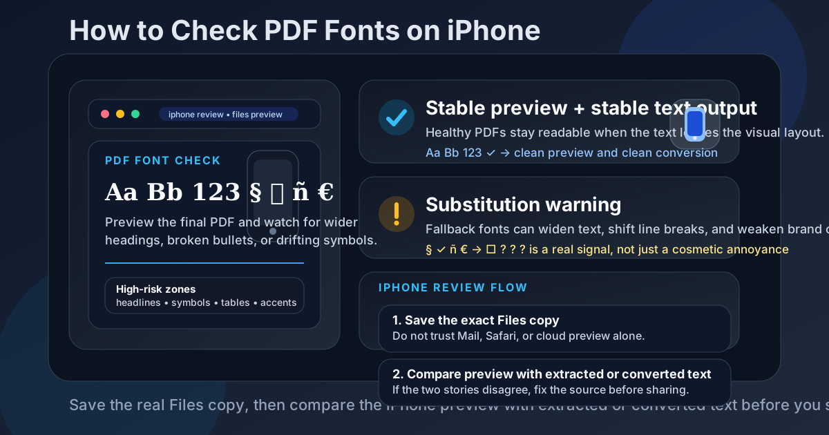
Table of contents
- Quick start: check PDF fonts on iPhone in about 6 minutes
- What you are really checking when you inspect PDF fonts
- Where iPhone users get misled
- Step-by-step: how to check PDF fonts on iPhone
- Fast signs that the PDF is using unstable fonts
- Font issue or OCR issue? How to tell on iPhone
- When to leave the PDF alone vs rebuild it
- Related LifetimePDF tools and guides
- FAQ
Quick start: check PDF fonts on iPhone in about 6 minutes
If your real goal is simply tell me whether this PDF's typography will survive the next handoff, use this order:
- Save the exact PDF you plan to email, upload, sign, print, archive, or share into the Files app.
- Open the final copy and look first at headings, bullets, symbols, page numbers, tables, accented names, and any text that has to stay visually precise.
- Watch for widened headlines, odd spacing, broken legal marks, missing checkmarks, or one section that suddenly feels off-brand.
- Run PDF to Text or PDF to Word and compare the output with what the PDF looked like in preview.
- If the conversion behaves badly while the preview looked mostly okay, assume the problem is real and not just cosmetic.
- If the file came from a scan, run OCR PDF first so weak text recognition does not get mistaken for font trouble.
What you are really checking when you inspect PDF fonts
Checking PDF fonts on iPhone is not only about identifying the typeface family. In real work, the more useful question is whether the PDF is still carrying the text cleanly enough that the file behaves the same way outside the original mobile preview.
In practice, that means looking for three things:
- Substitution: the intended font was replaced or approximated, so text looks wider, heavier, narrower, or less consistent.
- Broken glyph support: arrows, bullets, accents, legal marks, currency, math, icons, or non-English characters stop rendering properly.
- Layout drift: line breaks, table alignment, page numbers, or spacing change enough that the PDF starts feeling fragile.
Good outcome
The PDF preview looks clean, text extraction stays readable, and the converted copy does not suddenly widen or break important characters.
Warning outcome
The iPhone preview looks mostly fine, but conversion or copy-based checks expose unstable symbols, messy spacing, or fallback text.
Typical root cause
A missing font, a weak export path, a mixed-source document, or a scan that only looked like a real text document on screen.
Where iPhone users get misled
iPhone gives you several fast ways to glance at a PDF. That is convenient, but it also creates false confidence. A file can look trustworthy inside one mobile preview and still fall apart when somebody extracts text, converts it, or opens it in another workflow.
| Viewing path | What it is good for | What it cannot safely prove |
|---|---|---|
| Files preview and quick open | Confirming you saved the right file and doing a fast visual first pass. | That the text layer is healthy, the font is really embedded correctly, or the PDF will behave cleanly during reuse. |
| Mail preview, Safari preview, Messages, or cloud-drive preview | Checking whether the document looks familiar and opens without obvious corruption. | That symbols, accents, and spacing will survive conversion, copy-and-paste, or another viewer outside that preview. |
| Acrobat Reader or another fuller iPhone PDF viewer | Giving you a better final-copy review and a stronger sense of page-level consistency. | You still need a text or Word test if the real risk is hidden substitution or unstable font behavior. |
| Extraction or conversion test | Revealing whether the text behaves cleanly once the layout protection disappears. | It does not tell you why the file broke, only that the current PDF is less stable than it looked. |
Step-by-step: how to check PDF fonts on iPhone
This workflow gives you a dependable answer without turning a simple mobile PDF review into a giant technical detour.
Step 1: Save the exact iPhone copy first
If the PDF is still sitting in Mail preview, a Safari tab, a Messages attachment, or a cloud-drive preview, save it first. The point is to inspect the exact file you are about to send onward, not a preview layer that may hide the real behavior.
Step 2: Start with the high-risk text zones
Do not spend your first minute on an easy paragraph in the middle of page three. Go where font trouble reveals itself fastest:
- cover-page headlines and subheads,
- tables and tightly aligned columns,
- bullets, arrows, checkmarks, and icon-like characters,
- currency symbols, legal marks, math, and footnotes,
- names with accents or non-English characters,
- one section that came from a different template, app, or contributor.
Step 3: Compare the preview with text behavior outside the layout
Use PDF to Text to strip away page design and see whether the characters themselves still behave. If bullets turn weird, accents collapse, or spacing suddenly feels messy, that is useful evidence that the PDF is only visually tolerating the current typography.
Step 4: Run a Word conversion if reuse matters
If the PDF is likely to be edited, repurposed, quoted, or mined for text, run a quick PDF to Word check. Many font problems hide inside the finished PDF view and only become obvious when the content has to behave like editable text again.
If you want the broader explanation of why this matters, the companion guide What Happens to PDF Fonts When Converting to Word goes deeper.
Step 5: Decide whether you are looking at a font problem or a scan problem
On iPhone, scanned PDFs are a common trap because Notes scans, camera-based scanner apps, and quick document capture flows can produce pages that look crisp while the text layer underneath is weak. If the PDF came from a scanner, copier, or phone-camera workflow, clean it with OCR PDF before you judge the typography too harshly.
Step 6: Re-check the final saved copy once
If you repair the source or export settings, make a fresh PDF and run one final pass on the actual saved file. This is the simplest way to avoid the classic mobile mistake where the fixed draft exists, but the wrong PDF is still the one that gets shared from the original thread or app.
Reliable sequence: save the real iPhone copy, inspect the risky sections, compare extracted text, test conversion if reuse matters, and only rebuild the source when the PDF proves it is unstable.
Fast signs that the PDF is using unstable fonts
These are the patterns that usually matter in real workflows, not just in design debates.
| What you notice | What it usually means | Best next move |
|---|---|---|
| Headings wrap differently than expected | A fallback or substituted font is changing the width of the text. | Compare the PDF with the source and test a fresh export. |
| Bullets, arrows, checkmarks, or icons look wrong | The PDF is missing glyph support or relying on fragile font characters. | Check text extraction and rebuild those elements from a safer source if needed. |
| Accents, currency, or legal marks become messy | The file is weak in multilingual or symbol coverage. | Use OCR only for scans, otherwise fix the source font and export again. |
| Only one section looks off-brand | The PDF may be a mixed-source document with pasted pages or reused templates. | Normalize the source content instead of patching page by page later. |
| The preview looks okay, but conversion output breaks | The text layer is less stable than the visual preview suggests. | Treat the problem as real and repair the export path before sharing widely. |
Healthy default
If the PDF only feels reliable in one iPhone preview and starts behaving strangely anywhere else, the typography is not healthy enough yet.
Font issue or OCR issue? How to tell on iPhone
A surprising number of “font” problems are actually text-recognition problems. If the PDF came from a scanner, copier, or photographed pages, the visible text may not be live text at all. It may be page images with a weak OCR layer sitting underneath.
Signs it may really be an OCR issue
- You cannot select text cleanly in several places.
- Copy-and-paste turns normal words into nonsense.
- The file came from Notes scan, a scanner app, or a phone camera.
- The preview looks fine, but extracted text is chaotic everywhere, not just in one font family.
In that case, run OCR PDF first, then judge the typography on the cleaned result. Otherwise you can waste time blaming fonts for damage that started earlier in the document pipeline.
When to leave the PDF alone vs rebuild it
Not every PDF needs a rescue mission. The useful question is whether the file is stable enough for the next handoff.
Leave the PDF alone when
- the preview looks consistent across the risky sections,
- text extraction stays readable,
- symbols and accents survive,
- conversion behavior does not reveal hidden instability,
- you would only be rebuilding the file to feel busy rather than to solve a real mismatch.
Rebuild or re-export the PDF when
- headings widen or wrap unpredictably,
- important symbols or accented names break,
- the text layer behaves worse than the visual preview,
- the file mixes multiple templates, scans, or export paths,
- the same document will be reused, edited, or sent into a workflow where typography matters.
My practical opinion: if the PDF is business-critical, legally sensitive, brand-sensitive, or likely to be converted later, it is usually smarter to repair the source once than to hope every downstream viewer tolerates the same fragile file.
FAQ
How do I check PDF fonts on iPhone?
Save the final PDF into Files, inspect the real copy in an iPhone viewer, then compare the visual result with extracted or converted text. If headings wrap differently, symbols break, or spacing shifts, the file likely has real font trouble.
Can Files or Mail preview tell me whether a PDF font is broken?
Not completely. Files or Mail preview helps you confirm the right file and do a quick first pass, but a stronger iPhone check compares the final preview with text extraction or conversion behavior.
What is the fastest sign of PDF font substitution on iPhone?
Look for widened headings, broken bullets, strange spacing, missing checkmarks, damaged accents, or one section that suddenly feels visually off compared with the rest of the document.
Should I fix font problems in the PDF or in the source file?
If you still have the source file, fix it there first. A clean re-export is usually more reliable than trying to patch a finished PDF after the typography has already drifted.
Can scanned PDFs create fake font problems on iPhone?
Yes. Weak OCR often imitates broken typography, so scanned PDFs should be OCRed first before you blame the fonts alone.
Published by LifetimePDF — Pay once. Use forever.