Check PDF Fonts: Catch Missing, Substituted, or Broken Type Before the Layout Shifts
To check PDF fonts, inspect the final file for substituted typefaces, broken symbols, odd spacing, and text that changes shape when you print, extract, or convert it.
If the PDF swaps fonts, drops glyphs, or reflows unexpectedly, the source file or export settings need attention before you share the document.
That is the short answer. The practical answer is that font problems rarely announce themselves with a giant warning banner. They usually show up as something slightly off: a heading that looks heavier on one machine, bullets that turn into squares, numbers that stop lining up, accented characters that go strange, or a perfectly normal PDF that falls apart the moment somebody converts it to Word. A quick font check helps you catch those failures before the file reaches a client, printer, compliance portal, archive, or executive review.
Fastest practical path: review the final PDF on screen, test a few high-risk sections, compare extracted or converted text, then fix the source and export a clean copy if anything looks substituted or unstable.
In a hurry? Jump to quick start: check PDF fonts in about 7 minutes.
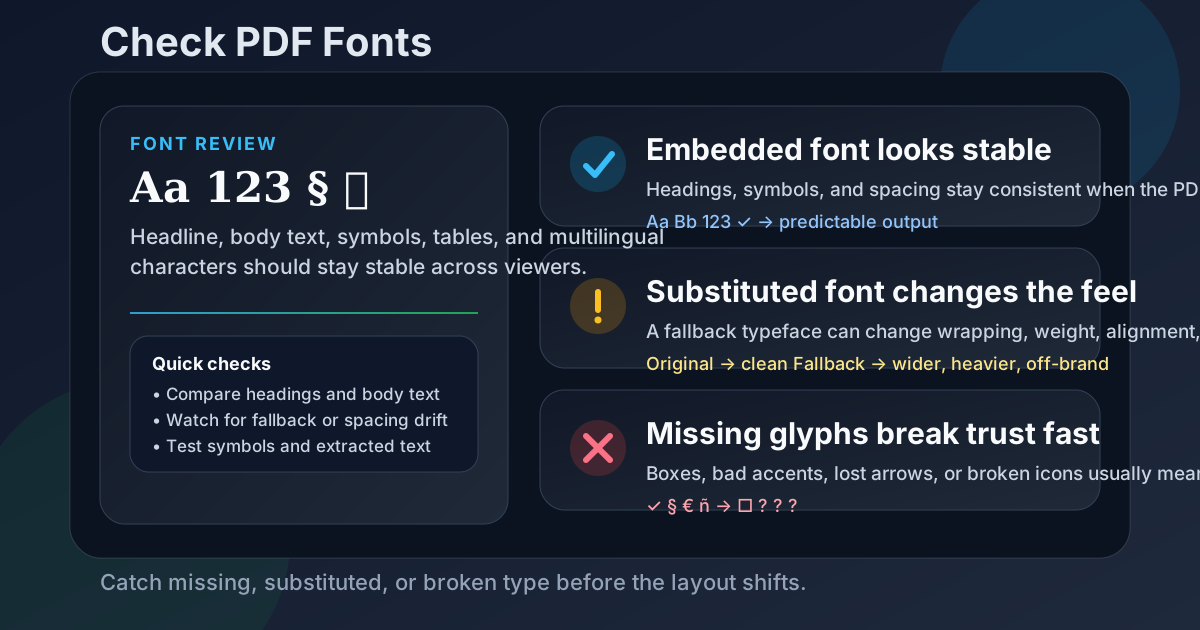
Table of contents
- Quick start: check PDF fonts in about 7 minutes
- What checking PDF fonts actually means
- The fastest signs a PDF font problem is real
- Step-by-step: practical PDF font review workflow
- Common font failure patterns
- Why font issues show up during conversion, printing, and sharing
- When the real fix belongs in the source file
- Final checklist before you share or archive the file
- Related LifetimePDF tools and guides
- FAQ
Quick start: check PDF fonts in about 7 minutes
If your real goal is simply tell me whether this PDF's typography will survive the next handoff, this short review catches most practical failures fast:
- Open the exact PDF you plan to share, print, upload, or archive. Do not inspect an older draft and assume the export stayed the same.
- Scan headings, body text, bullets, symbols, tables, and page numbers for anything that looks inconsistent, cramped, jagged, or unexpectedly wider than the rest.
- Pay extra attention to logos, multilingual text, accented characters, math, legal symbols, checkboxes, and icon-based graphics because those areas break first.
- Use PDF to Text or PDF to Word to see whether the text behaves cleanly outside the original layout.
- If a conversion suddenly changes spacing, swaps symbols, or loses emphasis, suspect a font problem even if the PDF itself looked mostly fine.
- If the file came from a scan, run OCR PDF first so you are not mistaking OCR noise for a typography issue.
What checking PDF fonts actually means
When people say they need to check PDF fonts, they usually mean one of three things:
- Does this PDF still use the right typefaces? Brand fonts, legal forms, design proofs, and polished reports can look subtly wrong when a fallback font sneaks in.
- Will the text survive other workflows? A file that looks acceptable in one viewer may break when someone prints it, annotates it, extracts text, or converts it to Word.
- Are any characters missing or being faked? Symbols, ligatures, bullets, accented letters, and non-Latin scripts are common failure points when embedding is incomplete or substitution kicks in.
The point is not to become a font engineer. The point is to confirm the PDF behaves like a stable document instead of a fragile export that only looks right on the computer that created it.
| What you are checking | What healthy behavior looks like | What a problem looks like |
|---|---|---|
| Typeface consistency | Headings and body text keep a stable visual style from page to page | One section looks heavier, narrower, wider, or clearly off-brand |
| Character coverage | Bullets, symbols, accents, and special characters display correctly | Boxes, question marks, missing symbols, or odd replacements appear |
| Spacing and reflow | Lines, tables, labels, and page numbers stay aligned | Text wraps differently, columns drift, or numbers stop lining up |
| Workflow stability | Printing, extraction, and conversion still look clean | The PDF works in one view but breaks when reused elsewhere |
The fastest signs a PDF font problem is real
Font issues often look small until they start affecting trust, readability, or conversion quality. These are the clues worth taking seriously.
Unexpected style changes
A heading or label suddenly looks like it came from a different template or software export.
Broken symbols
Bullets, arrows, checkmarks, math characters, or currency symbols turn into boxes or random replacements.
Spacing drift
Text wraps differently, labels touch the wrong lines, or tables lose their visual rhythm.
Conversion fallout
A Word or text conversion exposes weird characters, unstable spacing, or missing emphasis that was hidden in the PDF view.
One subtle clue matters more than people think: if only a few pages look wrong, that usually means the problem is real. Partial inconsistency often points to a mixed-source document, a pasted section, a missing font in one component, or an export pipeline that handled some pages differently than others.
Quick smell test
If the document only looks correct in the app that created it, but feels fragile everywhere else, you are not looking at a stable PDF yet.
Step-by-step: practical PDF font review workflow
1) Start with the final exported PDF
Font issues often appear during the last export, merge, flattening pass, or print-to-PDF shortcut. That means the draft inside your authoring app may still look fine while the real share-ready file has already drifted. Always inspect the actual PDF you intend to send.
2) Review the visually risky areas first
Start where font problems are easiest to notice and most expensive to ignore:
- cover-page headlines and subheads,
- tables and numeric columns,
- footnotes and small legal text,
- bullets, icons, and checkboxes,
- equations, currency, and trademark symbols,
- names with accents or non-English characters.
If those sections are clean, the rest of the PDF is much more likely to be healthy too.
3) Compare visual reading with extracted text behavior
Use PDF to Text to see how the document behaves when the page design is stripped away. If characters disappear, line order gets strange, or certain symbols turn into nonsense, the text layer or font mapping may be unstable even if the PDF still looked decent on screen.
4) Run a realistic conversion test when the file will be reused
If the PDF is going to be edited, repurposed, or mined for text, run a quick PDF to Word conversion. Fonts that survive visual reading sometimes fall apart during conversion, especially in files with custom branding, ligatures, scanned inserts, or mixed-language text.
If you want more context on that specific failure mode, see What Happens to PDF Fonts When Converting to Word.
5) Separate font issues from OCR issues
Scanned documents complicate this because a bad OCR layer can mimic a font problem. If the source was scanned or photographed, run OCR PDF first, then inspect the recovered text. Otherwise you can waste time blaming typography for what is really an image-to-text problem.
6) Fix upstream, then verify one more time
If the PDF is substituting fonts, missing glyphs, or changing layout, the cleanest solution is usually to fix the source document, export settings, or font embedding behavior upstream. Once that is done, generate a fresh PDF and do one final spot-check on the exact version you will deliver.
Reliable sequence: inspect the final PDF, test the risky sections, compare extracted text, run a realistic conversion if the file will be reused, then re-export a clean copy if anything drifts.
Common font failure patterns
Most PDF font problems repeat themselves. Once you know the pattern, it is easier to choose the right fix.
| Failure pattern | What it looks like | Better response |
|---|---|---|
| Fallback substitution | The PDF opens, but one section looks wider, narrower, heavier, or visually "off" compared with the source. | Re-export from the source with the intended fonts available and embedded properly. |
| Missing glyph coverage | Symbols, accents, math, arrows, or multilingual characters turn into boxes, blanks, or strange replacements. | Use a font that truly supports the needed characters and rebuild the PDF. |
| Mixed-source inconsistency | Only a few pages or pasted sections look wrong because they came from another template or design file. | Normalize the source content before the final export instead of patching the PDF later. |
| Icon-font confusion | Checklist marks, arrows, or UI icons vanish or convert badly because they were really font characters, not graphics. | Rebuild those elements in a safer way or verify the font travels correctly with the file. |
| OCR mistaken for typography | The PDF looks rough because the text layer itself is low quality, not because the chosen font is wrong. | Improve OCR or recover the source text before doing typography cleanup. |
The important point is that font problems are often workflow problems. They rarely come from the font alone. They usually come from a conversion shortcut, a missing system font, a scanned insert, a pasted section, or a source file that was never cleaned up after handoff.
Why font issues show up during conversion, printing, and sharing
People often assume that if a PDF looks acceptable on their laptop, the font question is closed. It is not. Many typography failures appear only when the file leaves its original environment.
Conversion reveals hidden instability
Converting to Word or plain text removes the protection of the original page layout. That is why extracted output is so useful: it exposes whether the text layer, character mapping, and spacing were solid or just visually tolerated inside the PDF.
Printing can expose substitution and spacing drift
A font that looks acceptable on screen may print with different weight, wrapping, or symbol behavior, especially in tables, certificates, forms, and tightly designed branded materials. If the PDF is headed to a printer, a final visual check matters more than usual.
Sharing across machines increases risk
The moment a PDF moves between operating systems, teams, legal portals, archival systems, or client devices, you increase the chance that a weak export pipeline gets exposed. A robust PDF should not depend on one viewer's lucky tolerance.
When the real fix belongs in the source file
If you still control the source document, fix font problems there first. Trying to patch the finished PDF is often slower and less reliable than correcting the original file and exporting again.
Source-first repair is usually the better move when:
- the PDF uses brand fonts that must stay visually exact,
- multiple pages came from different templates or contributors,
- special characters or multilingual sections are involved,
- the file will later be updated again and you want the fix to stick,
- conversion to Word, text, or HTML is part of the workflow.
If the source is gone and you only have the PDF, focus on the version that needs to survive now. That may mean checking readability, text extraction, and conversion quality closely, then deciding whether a fresh recreation is safer than forcing the damaged PDF through more downstream steps.
Final checklist before you share or archive the file
Before the PDF leaves your hands, run this short checklist:
- Did you inspect the exact final PDF instead of an earlier draft?
- Do headings, body text, page numbers, and symbols look consistent across the file?
- Did you test at least one high-risk section with accents, symbols, icons, or tightly aligned text?
- Does extracted or converted text still behave cleanly?
- If the PDF came from a scan, did you separate OCR quality from font quality?
- If the typography matters commercially or legally, did you verify the source and re-export instead of hoping the viewer will compensate?
- Did you perform one final spot-check on the actual copy you will print, send, upload, or archive?
You do not need a forensic typography lab for this. You just need enough discipline to catch the invisible changes that make a polished document feel amateur, unstable, or risky once it leaves the original machine.
Ready to sanity-check the file? Inspect the text behavior now, test one realistic conversion, and send a PDF that keeps its type, spacing, and symbols intact.
Best workflow for stable typography: check the final PDF → inspect risky sections → compare extracted text → test conversion if reuse matters → fix the source → re-export and verify once.
Related LifetimePDF tools and guides
If your font check uncovers a wider problem, these are the most useful next steps:
Inspect and test the file
- View PDF Properties for a broader document check
- PDF to Text to inspect the text layer directly
- PDF to Word to expose conversion-related font problems
Related cleanup paths
- What Happens to PDF Fonts When Converting to Word
- Check PDF Page Size if layout drift is part of the problem
- OCR PDF when the file is scanned and text quality is uncertain
FAQ
1) How do I check PDF fonts?
Open the final PDF and review how the text, headings, bullets, symbols, and special characters actually render. Then compare that with extracted or converted text to catch hidden substitution, spacing, or glyph problems before you share the file.
2) Why do PDF fonts matter if the file already opens?
Because opening is not the same as behaving well. A PDF can display on your machine while still using fallback fonts, losing characters, drifting in print, or converting badly when somebody else needs to reuse the file.
3) What is font substitution in a PDF?
It happens when the intended typeface is unavailable or not embedded correctly, so the viewer swaps in another font. That can change spacing, page flow, appearance, and even symbol behavior.
4) Can a PDF font problem show up only during conversion?
Yes. Some files look acceptable inside the PDF view but reveal unstable character mapping, spacing, or missing glyphs when you convert them to Word or extract plain text.
5) Is it better to fix font issues in the PDF or in the source file?
If you still have the source, fix it there first. A clean re-export is usually more dependable than patching a finished PDF after type, embedding, and layout issues have already been baked in.
Published by LifetimePDF — Pay once. Use forever.