Check PDF Alt Text Online: Fast Browser-Based Tests for Images, Charts & Decorative Content
To check PDF alt text online, run the file through an accessibility checker, review every meaningful image, chart, logo, or screenshot in context, and confirm decorative visuals stay quiet.
If a description is empty, vague, or misses the point of the visual, the PDF is not ready for publishing, compliance review, or confident sharing.
Online review is useful because it gives you a fast browser-based workflow when you want real answers without hunting through desktop menus. It can surface missing descriptions quickly, but the final judgment is still human, especially for charts, screenshots, diagrams, and anything else where the image is carrying meaning. The most reliable workflow is simple: scan the PDF, inspect the visuals that matter, repair the source if the export is weak, and run one final pass before the file goes live.
Fastest path: run an accessibility scan, review meaningful visuals manually, fix weak source exports, and retest the final PDF before you publish it.
In a hurry? Jump to quick start: check PDF alt text online in about 8 minutes.
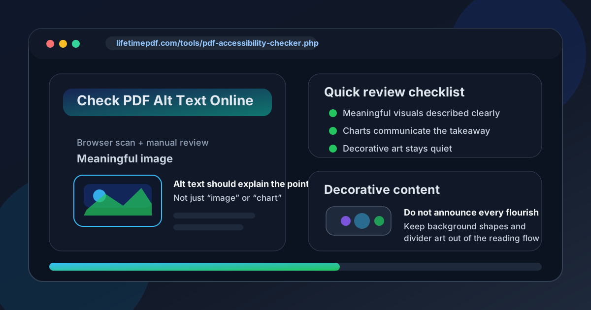
Table of contents
- Quick start: check PDF alt text online in about 8 minutes
- What online alt-text checks can and cannot prove
- Step-by-step: practical browser workflow
- What needs alt text and what should stay decorative
- Most common failures in real PDFs
- Scans, charts, logos, screenshots, and complex figures
- When the right fix belongs in the source file
- Final checklist before you publish or share
- Related LifetimePDF tools and guides
- FAQ
Quick start: check PDF alt text online in about 8 minutes
If your goal is simply tell me whether the images in this PDF are described well enough before I send it out, this is the fastest useful browser workflow:
- Open PDF Accessibility Checker and upload the exact PDF you plan to publish, email, or share.
- List the visuals that carry meaning: charts, screenshots, diagrams, maps, product photos used for instructions, logos used as identifiers, and explanatory figures.
- Review the descriptions for those visuals in context instead of trusting a pass/fail badge on its own.
- Make sure decorative elements such as divider lines, flourishes, and background shapes are not being announced like meaningful content.
- If the PDF is a scan or behaves like images instead of selectable text, run OCR PDF before judging the file too harshly.
- If the descriptions are weak or missing, fix the source and export a cleaner PDF before a final online retest.
What online alt-text checks can and cannot prove
A browser-based accessibility workflow is valuable because it is fast, repeatable, and easy to fit into real publishing habits. You can run a file, see where the obvious trouble is, and decide whether you are dealing with a small cleanup job or a structurally weak export.
What online checks are good at
- Surfacing likely image-description issues: empty or suspicious figure descriptions are easier to spot quickly.
- Showing whether the PDF is structurally weak overall: alt-text problems often travel with other accessibility problems.
- Helping teams triage files before release: you can screen a document in a browser before it reaches a public page, portal, or customer inbox.
- Keeping the workflow lightweight: no one has to delay a review because they are away from one specific desktop setup.
What online checks cannot judge on their own
- Whether a description is actually helpful: a checker can see that text exists, but not whether the wording captures the image's purpose.
- Whether a chart description communicates the real takeaway: “bar chart” is still weak alt text even if it is not empty.
- Whether decorative content should stay silent: a person still has to decide if a flourish is decoration or information.
- Whether the source export stripped meaning: automated output can tell you something looks wrong, but not always why the original workflow failed.
Step-by-step: practical browser workflow
1) Start with the exact PDF that will leave your hands
Review the real share-ready export, not an earlier draft. Alt text can disappear, duplicate, or change between versions, especially when a file has bounced between Word, PowerPoint, design tools, scanners, and multiple exports.
2) Run the accessibility scan first
Open PDF Accessibility Checker before you start manually hunting through every page. That first pass gives you a fast sense of whether the PDF looks broadly healthy or whether you are about to find missing text, scan problems, and structural issues all at once.
3) Identify the visuals that actually carry meaning
Not every image deserves equal attention. Start with the visuals a non-visual reader would miss if they disappeared: charts, process diagrams, interface screenshots, labeled figures, maps, product photos used for instructions, and logos that identify the organization behind the document.
4) Read each description in context
A decent alt-text review is not a game of counting how many images have some text attached. Read the heading, the nearby paragraph, and the image description together. Then ask whether the description finishes the meaning of the page or merely names the object.
5) Make sure decorative elements are not noisy
Decorative content causes just as much frustration as missing descriptions. Divider lines, abstract background shapes, repeated flourish icons, and purely ornamental images should not keep interrupting the reading experience like they are meaningful figures. A clean PDF does not just describe what matters; it also stays quiet about what does not.
6) Repair the source when the export is weak
If the PDF came from a source document you still control, that is usually where the real fix belongs. Recover editable content with PDF to Word if needed, repair the image descriptions in the source, and export a cleaner file with Word to PDF.
Reliable sequence: scan the PDF, review the visuals that matter, repair the source, and retest the final export before anyone else depends on it.
What needs alt text and what should stay decorative
A lot of confusion disappears once you separate meaningful visuals from decorative ones. That one distinction prevents both silent failures and noisy over-description.
| Visual type | Usually needs alt text? | What a good online review looks for |
|---|---|---|
| Charts and graphs | Yes | Check that the description communicates the trend, comparison, spike, warning, or conclusion that matters. |
| Instructional screenshots | Yes | Make sure the description explains the action or screen state the screenshot supports. |
| Diagrams and process flows | Yes | Confirm the description summarizes the structure or sequence the diagram adds to the page. |
| Logos used as identifiers | Usually yes | If the logo identifies the organization, the name is often enough. If it is purely decorative, do not force a description. |
| Product photos with instructional meaning | Usually yes | Check that the description tells the reader what feature, orientation, or action the photo is meant to show. |
| Divider lines, flourishes, background shapes | No | These should usually stay quiet instead of being announced like content. |
| Decorative stock photos | No | If the image adds no meaning, it should not clutter the reading experience. |
The test is simple: if removing the visual would remove meaning, it probably needs alt text. If removing it would only remove polish, it probably belongs in the decorative category.
Most common failures in real PDFs
Weak PDF alt text usually repeats the same few mistakes. Catching these patterns early is faster than trying to reinvent your review process for every file.
| Failure | Why it is a problem | Better fix |
|---|---|---|
| Descriptions like “image” or “graphic” | The reader learns almost nothing. | Describe the purpose or takeaway of the visual, not just the fact that it exists. |
| Decorative art announced as content | The document becomes noisy and tiring for assistive-technology users. | Keep purely decorative visuals out of the reading experience. |
| Charts labeled without the conclusion | The reader hears the object type but misses the actual message. | Write the trend, comparison, or warning the chart is meant to show. |
| Screenshots named without the step they support | The image is present, but the instruction still feels incomplete. | Explain what the user is supposed to notice or do on the screen. |
| Scanned pages mistaken for ordinary image issues | The document may need OCR before accessibility checks become meaningful. | Run OCR PDF first, then review the rebuilt text layer and figure descriptions. |
| Source exports that drop or weaken descriptions | The PDF inherits problems from the workflow upstream. | Fix the source document and create a fresh export instead of repeatedly patching the final file. |
Scans, charts, logos, screenshots, and complex figures
Some visuals deserve a little more judgment than a quick yes-or-no check. These are the cases where online review is most helpful when paired with common sense.
Scanned PDFs
If the PDF behaves like page images instead of selectable text, run OCR PDF before deciding the file is hopeless. OCR does not magically write great alt text, but it does make the document easier to review and often reveals whether the export is salvageable.
Charts and graphs
Charts should communicate the takeaway, not just the format. “Pie chart” is rarely enough. A better description explains the comparison, growth trend, drop, imbalance, or ranking that the chart adds to the surrounding argument.
Screenshots and interface captures
For screenshots, ask what the image teaches. Is it showing which menu to open, where a setting lives, what a completed step looks like, or which button matters next? If the alt text does not answer that, the screenshot is not pulling its weight for a non-visual reader.
Logos and branding elements
A logo used to identify the organization usually needs only the organization name. A decorative brand flourish often needs nothing. The right decision depends on whether the image carries meaning or just decoration.
Complex diagrams and dense figures
One short alt-text field cannot always carry the full burden of a complicated visual. In those cases, a concise description should capture the role of the figure while nearby body text or a caption carries the deeper explanation. The online review question is still the same: does the reader understand what the figure contributes?
When the right fix belongs in the source file
The fastest long-term fix is often upstream. If the PDF came from Word, PowerPoint, Canva, or another editable workflow, that source file usually gives you better control over image descriptions than repeated after-the-fact repairs inside the final PDF.
- Use PDF to Word if you need to recover editable content.
- Repair weak or missing image descriptions in the source document.
- Export a clean new PDF with Word to PDF or the appropriate source workflow.
- Run one final browser-based accessibility check before the file goes back into circulation.
Final checklist before you publish or share
Before the PDF leaves your desk, do one last practical pass:
- Did you review the exact final PDF, not an older draft?
- Did meaningful charts, screenshots, diagrams, and figures get descriptions that explain their purpose?
- Did decorative visuals stay out of the reading experience?
- Did you run OCR first if the file was scan-based or image-heavy?
- Did you repair the source file if the export was weak?
- Did you retest the final PDF after the fixes?
If those answers are yes, you are in much better shape than someone who simply saw a green accessibility badge and clicked publish.
Related LifetimePDF tools and guides
Alt-text review works best as part of a broader PDF accessibility workflow. These tools and guides fit naturally with the browser-based review process above.
FAQ
How do I check PDF alt text online?
Upload the PDF to an accessibility checker, identify the visuals that carry meaning, and review each description in context. The point is to confirm that important images explain what matters while decorative visuals stay quiet.
Can an online checker tell me whether the alt text is actually good?
Not fully. A checker can tell you whether text exists and whether some obvious accessibility issues are present, but a person still has to decide whether the description captures the purpose of the visual in context.
Do decorative images in a PDF need alt text?
Usually no. Decorative lines, abstract background shapes, and ornamental graphics should generally stay out of the reading experience instead of being described like meaningful content.
What should alt text say for charts and screenshots?
Charts should communicate the takeaway, trend, or comparison that matters. Screenshots should explain what the reader is meant to notice or do, not merely name the interface.
Should I fix alt text in the PDF itself or in the source file?
If you still control the source file, fix it there first. Source applications usually produce cleaner exports than repeated patching inside the final PDF, especially when the same template will be reused again.