How to Check PDF Alt Text on Chromebook: Files, Chrome, and Image Descriptions Before You Share
To check PDF alt text on Chromebook, save the final PDF into Files or open it in Chrome, review every meaningful image, and confirm each description tells a non-visual reader what matters.
If a chart, screenshot, logo, or figure is important but silent, vague, or treated like decoration, the PDF is not ready to upload, email, or publish.
That is the short answer. The more useful answer is that Chromebook previews are fast, clean, and easy to trust too early. A PDF can look perfectly fine in Chrome, Files, Drive, Gmail, or Classroom and still be hiding missing image descriptions, decorative noise, or a weak export that never carried the right accessibility signals forward. The practical job is not admiring the page in a browser tab. It is verifying that the meaning of each important visual still survives when the reader cannot see the visual at all.
Fastest practical path: save the real Chromebook copy, list the visuals that matter, run an accessibility check, judge the descriptions manually, fix the source if needed, and retest before the PDF leaves your device.
In a hurry? Jump to quick start: check PDF alt text on Chromebook in about 7 minutes.
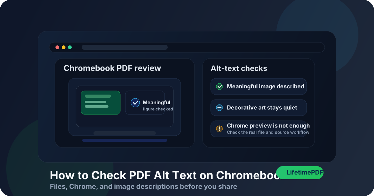
Table of contents
- Quick start: check PDF alt text on Chromebook in about 7 minutes
- What you are really checking on Chromebook
- Where Chromebook users get misled
- Step-by-step: how to check PDF alt text on Chromebook
- Warning signs that the PDF only looks accessible
- Charts, screenshots, logos, and decorative artwork
- When to fix the source versus patch the PDF
- Related LifetimePDF tools and guides
- FAQ
Quick start: check PDF alt text on Chromebook in about 7 minutes
If your real question is tell me whether this Chromebook PDF handles image descriptions properly, use this order:
- Open the exact PDF you plan to send, upload, archive, publish, or submit from Files, Downloads, Drive, Gmail, or Classroom. Temporary previews create fake confidence fast.
- List the visuals that carry meaning: charts, screenshots, diagrams, product photos, maps, logos, and figure panels. Ignore decorative separators for now.
- Confirm the file is not hiding a deeper scan problem. If text selection is weak or the page behaves like a picture, run OCR PDF before acting too confident about accessibility.
- Use Chrome or your strongest available review path, then compare that with a broader PDF accessibility check.
- Judge whether each description explains the useful takeaway, not just whether some field seems to exist somewhere in the export.
- If several descriptions are missing, duplicated, or obviously weak, repair the source file and make a cleaner PDF instead of treating the current export as good enough.
What you are really checking on Chromebook
Checking PDF alt text on Chromebook is not the same as asking whether every image has a caption. It is a more precise review. You are verifying whether the document communicates the purpose of important visuals to non-visual readers while keeping decorative clutter out of the way.
In practice, that means looking for three things:
- Meaningful coverage: the charts, screenshots, diagrams, logos, photos, and figures that matter actually have a useful description.
- Context over noise: the description explains the point of the image in this document, not a robotic inventory of colors, shapes, or app chrome.
- Decorative restraint: flourishes, background art, and non-essential accents are not announced as if they were core content.
Good outcome
A non-visual reader learns what the image contributes and does not get buried under decorative nonsense.
Common failure
The PDF technically contains image-description data somewhere, but it is blank, generic, duplicated, or useless in context.
Best next move
Review the real file, then fix the original authoring workflow if the export repeatedly strips or weakens descriptions.
Alt text also overlaps with bigger accessibility signals. If the PDF is badly tagged, missing structure, or built from poor OCR, the image-description review usually gets messy too. That is why it helps to check alt text as part of a broader Chromebook accessibility pass, not as an isolated checkbox.
Where Chromebook users get misled
Chromebook gives you several easy ways to glance at a PDF. That convenience is useful, but it can also create false confidence. A file can look trustworthy in Files, Chrome, Drive, Gmail preview, or a cloud-drive handoff and still be structurally weak underneath.
| Chromebook viewing path | What it is good for | What it cannot safely prove |
|---|---|---|
| Files preview or a quick browser preview | Confirming the file opens, the right pages are present, and the important visuals are easy to spot. | That meaningful figures have strong descriptions or that decorative artwork is handled correctly. |
| Chrome PDF viewer | A useful second opinion when you want a cleaner pass on complex layouts, forms, charts, or screenshots. | A field can exist and still say almost nothing useful. Viewer confidence is not the same as content quality. |
| Gmail, Drive, or Classroom preview | Useful for a quick first pass and confirming you are looking at the right attachment. | That the final downloaded copy preserved the image descriptions from the source document. |
| A quick text-layer or accessibility check | Helping you notice whether meaningful visuals seem invisible or decorative art is getting too much attention. | Whether the wording is truly strong in context without human judgment. |
| Accessibility checker results | Surfacing likely issues, missing structure, and patterns worth inspecting first. | Whether the wording is actually helpful to a real person reading the document for a purpose. |
Step-by-step: how to check PDF alt text on Chromebook
This workflow gives you a dependable answer without turning a fast Chromebook review into a giant remediation project.
Step 1: Start with the final Chromebook copy
Review the exact file that will leave your device. If the PDF is still living inside Gmail preview, Drive preview, Classroom, or a browser tab, save the real copy into Files first. Alt-text review only matters when you inspect the same PDF that will actually be shared.
Step 2: Identify the visuals that actually carry meaning
Make a quick inventory. Which visuals would leave a reader confused if they disappeared? Those are the ones that need real attention: charts, screenshots, diagrams, photos with business value, scanned signatures in context, logos that identify the source, product images, maps, and figure panels.
Step 3: Confirm the text layer before you judge the rest
If the PDF is a scan or a weak export, the alt-text review may sit on top of a bigger structural problem. Try selecting text, searching a visible word, or reviewing the Chromebook text-layer guide when the file behaves like a picture. OCR will not magically write thoughtful alt text, but it can make the rest of the Chromebook accessibility review far less murky.
Step 4: Review the figures in the strongest Chromebook tool you have
Chrome is fine for a quick visual pass. For a real check, use the best accessibility-oriented review path available to you on Chromebook, then compare what it shows with your own list of meaningful visuals. If the document contains five important figures and your review only surfaces two, something is off already.
If you want the broader non-platform explanation too, the companion guide Check PDF Alt Text goes deeper into the underlying logic.
Step 5: Judge the quality of the description, not just the existence of one
Weak alt text usually fails in one of four ways: it is blank, generic, copied from a filename, or so literal that it misses the point. A good description explains what the reader needs from the image in this document. For a chart, that is usually the trend or takeaway. For a screenshot, it is the important state, setting, or result. For a logo, it may only need identification.
Step 6: Separate decorative visuals from meaningful ones
One of the most common Chromebook review mistakes is treating every visible graphic as equally important. That produces noisy, exhausting output for assistive technology users. Decorative flourishes should stay quiet. Meaningful visuals should speak clearly.
Step 7: Rebuild the source when the export is obviously weak
If the same file has several missing or low-quality descriptions, the problem usually started upstream. Use PDF to Word when you need an editable starting point, repair the original content, and export a cleaner final PDF. Repeated patching of a bad export is usually slower than fixing the real source once.
Reliable sequence: final Chromebook copy → identify meaningful visuals → verify the text layer → run an accessibility check → judge the descriptions → rebuild the source if needed → retest the finished PDF.
Warning signs that the PDF only looks accessible
These are the patterns that usually matter in real Chromebook workflows, not just in theory.
| What you notice | What it usually means | Best next move |
|---|---|---|
| The PDF looks polished, but important charts are silent | The export likely lost descriptions or never had them. | Check the source file and rebuild the PDF. |
| Every image seems to have the same vague wording | The descriptions may have been auto-filled or copied mechanically. | Rewrite the important ones so each image has a real purpose statement. |
| Decorative icons are described, but the main figure is not | The file has its priorities backwards. | Mark decorative visuals appropriately and rewrite the meaningful image descriptions first. |
| The PDF is scan-heavy and hard to inspect | You may be fighting both OCR and accessibility problems at once. | Repair the text layer first, then revisit the figures. |
| A screenshot description names buttons and colors but misses the actual result | The wording is visual but not useful. | Rewrite it around the outcome the reader needs to know. |
Healthy default
If the PDF only feels accessible while you stare at the page, but the important visual would become meaningless to a non-visual reader, the alt text is not healthy enough yet.
Charts, screenshots, logos, and decorative artwork
Chromebook PDF review gets trickiest when the file mixes several visual types. The alt-text approach should change with the job the image is doing.
Charts and diagrams
Describe the takeaway, relationship, or decision-driving fact. A reader usually needs the point of the chart, not a literal inventory of every bar, arrow, and color.
Screenshots
Say what the screenshot proves, shows, or confirms. If the image documents a setting, error, workflow state, or result, that meaning belongs in the description.
Logos and brand marks
Most logos only need identification if they matter in context. Do not turn every small brand mark into a paragraph just because it is visible on the page.
Decorative artwork
Background swirls, divider flourishes, and mood-setting graphics are usually better kept silent than announced as meaningful content.
A practical test helps here: if you are debating whether a visual matters, ask what breaks when a reader never sees it. If the answer is nothing important, it is probably decorative. If the answer is they miss a key claim, result, or instruction, it needs a thoughtful description.
When to fix the source versus patch the PDF
Not every Chromebook accessibility issue deserves the same response. The useful question is whether the PDF is close enough to healthy that a light repair makes sense, or whether the source file is clearly the better place to fix it.
Patch lightly or leave the PDF alone when
- only one or two meaningful visuals need small wording improvements,
- the rest of the document already behaves well in accessibility review,
- the source file is unavailable but the final PDF is otherwise solid,
- you are making a minor correction rather than rescuing a broken export chain.
Fix the source and re-export when
- multiple important images are missing descriptions,
- decorative visuals are repeatedly treated as meaningful content,
- the document comes from a template or workflow that keeps repeating the same mistake,
- the PDF is scan-heavy, badly OCRed, or structurally weak beyond alt text alone,
- the file will be published, reused, or reviewed seriously for accessibility quality.
If the PDF matters to more than one reader, more than one device, or more than one round of reuse, upstream repair usually wins. A clean export is easier to trust than a fragile patch job.
FAQ
How do I check PDF alt text on Chromebook quickly?
Save the final PDF on your Chromebook, list the meaningful visuals, run an accessibility check, and confirm the important images have useful descriptions while decorative items stay quiet. The goal is not just finding a field. It is making sure the image still makes sense when the reader cannot see it.
Can Chrome prove that the alt text is correct?
Not by itself. Chrome is useful for visual review and for confirming you have the right file, but the stronger test is whether meaningful visuals are described helpfully and decorative artwork is not being announced as content.
What is the fastest sign of bad alt text in a Chromebook PDF?
The fastest signs are important visuals with no meaningful description, repetitive generic wording across different images, or decorative icons being announced while charts and figures stay silent.
Should I OCR a scanned PDF before checking alt text?
Usually yes. OCR gives the file a usable text layer, which makes a real accessibility review possible instead of forcing you to judge a picture of text and graphics.
Should I fix the PDF directly or repair the source file?
If the issue is broad or repeats across several pages, fix the source file first. A clean re-export from Docs, Word, Slides, forms, or another editable source is usually more reliable than repeated patching of the final PDF.
Published by LifetimePDF — Pay once. Use forever.